What Are Font Jokes & Why People Love Them 🖋️
Font jokes are pun-based or observational humor about typography, letters, and design. People love them because:
Designers, writers, and creatives relate instantly.
Perfect for social media, memes, and design humor.
Great for office jokes, presentations, or typography content.
Clever, shareable humor that spreads fast in creative communities.

🖋️ Classic Font & Letter Jokes
Why did Helvetica break up with Times New Roman? It needed more space.
Comic Sans walked into a bar… everyone groaned.
Why don’t fonts ever play hide-and-seek? They always stand out.
I asked Arial out on a date—it said, “I’m too plain for that.”
Kerning jokes: they just won’t sit together.
Why did the letter A break up with B? It wanted more independence.
Bold text is never subtle… just like me.
Why did the font feel depressed? It was feeling italic.
Fonts at parties: always spaced out.
Why did the designer date only sans-serif? They couldn’t handle the serif drama.
Typographers have great alignment… in jokes, too.
Fonts don’t gossip—they just kern quietly.
Why did the letter S fail gym class? Bad curves.
Typography jokes: so aligned with fun.
Font humor: bold, italic, and hilarious.
💻 Digital & Web Font Jokes
Why do web fonts never lie? They’re always responsive.
Helvetica says to Arial: “You’re too mainstream.”
Why did the designer hate pixel fonts? They felt small-minded.
Fonts online: buffering for the punchline.
Why did the web font cross the browser? To render properly.
CSS jokes: style with humor.
Why do fonts love updates? To stay current.
Arial jokes: plain but punny.
Comic Sans walks into a website… cringe ensues.
Typography in HTML: <fun> guaranteed.
Why did the font fail SEO? Bad readability.
Web font humor: spacing matters.
Designers vs. fonts: a love-hate relationship.
Font files: too many formats, not enough laughs.
Web typography jokes: responsive and witty.
🖼️ Graphic Design Font Jokes
Why did the designer break up with Papyrus? It was overused.
Fonts at work: always leading and tracking.
Designers love kerning—it’s in their nature.
Why did the font blush? It got a point size compliment.
Serif jokes: classic and classy.
Why did the bold font get promoted? It stood out.
Designers and fonts: spacing is everything.
Why do fonts hate Comic Sans? Too many people use it unironically.
Italic jokes: slightly slanted but funny.
Font humor: leading to laughter.
Typography puns: kern you believe it?
Fonts in print: well-aligned humor.
Why did the font go to therapy? It had spacing issues.
Graphic design jokes: bold, colorful, and fun.
Designers say: “Never underestimate the power of a good typeface.”
🅰️ Letter & Alphabet Jokes
Why did A go to therapy? Too many capital issues.
B says to C: “Stop following me.”
Letters at school: always in line.
Why did Z get detention? It was acting too edgy.
Fonts love alphabets: letter-ally funny.
Why did Q break up with O? They needed some space.
A pun walks into a letter… kerning jokes everywhere.
Letter jokes: every line counts.
Why did the letters form a band? They wanted harmony.
Alphabet humor: always in order.
Letters gossip: you won’t believe the kerning drama.
Why did J feel lonely? Bad positioning.
Letters and fonts: the perfect pun combo.
Typography humor: alphabet soup for thought.
Letter puns: straight to the point.
🖨️ Print & Paper Font Jokes
Why did the printer hate Comic Sans? Too much drama.
Times New Roman walks into a print shop… classic as always.
Bold text on paper: can’t ignore it.
Why do fonts love ink? They feel more substantial.
Serif vs. sans-serif: a print rivalry.
Kerning jokes: never misplaced in print.
Why did the typewriter blush? It felt typed out.
Printing humor: always aligned with laughs.
Fonts in newspapers: making headlines funny.
Bold and italic: printed personality.
Paper jokes: full of typeface humor.
Font layout: spacing = comic relief.
Why did the page turn red? Poor kerning.
Typography jokes: ink-credible fun.
Print fonts: letter-perfect humor.
🖌️ Creative & Handwriting Font Jokes
Why did the cursive font break up? It was too looped up.
Handwriting jokes: always flowing.
Script fonts: fancy, yet funny.
Why did the marker laugh? Ink-tentionally hilarious.
Calligraphy jokes: beautifully punny.
Handwritten notes: the best place for font humor.
Brush fonts: stroke of genius humor.
Why did the pen feel awkward? Too many lines.
Designer handwriting jokes: slanted with style.
Fonts in journals: letters of laughter.
Handwriting humor: straight from the pen.
Script font jokes: looping with fun.
Marker jokes: bright and funny.
Lettering humor: brush up on your puns.
Handwriting puns: perfectly aligned.
🎨 Emoji & Iconic Font Jokes
Why did the emoji hate Comic Sans? Too expressive.
Wingdings jokes: can’t read but still funny.
Fonts + emojis = type-tacular humor.
Emoji font humor: visual punchlines.
Why did the smiley face go to therapy? Misaligned kerning.
Symbols are like fonts—they tell a story.
Font jokes with emojis: extra punctuation for laughs.
Iconic font humor: Helvetica and emojis unite.
Emoji jokes: small but impactful.
Fonts and icons: a design comedy duo.
Wingdings: letterless laughter.
Emoji typography: expressive and funny.
Symbol jokes: all kinds of fun.
Fonts with symbols: never boring.
Emoji font puns: a picture is worth a thousand laughs.
🖥️ Coding & Programming Font Jokes
Why did the developer hate Comic Sans? It caused too many syntax errors.
Monospace jokes: everything lines up perfectly… except my life.
Why do programmers love Consolas? It’s type-safe humor.
Fonts in code: indent-ically funny.
Why did the semicolon break up with the font? Misaligned expectations.
HTML fonts: bold or italic, still buggy.
Why did the CSS file blush? It had style.
Coding humor: kerning errors in real life.
Fonts in IDEs: spacing matters.
Why did the font go to debugging? Too many misalignments.
TypeScript jokes: strictly typed… but still funny.
Console logs: font humor in action.
Programmer fonts: monospace, pun-space.
Why did the developer pick Arial? For readability and laughs.
Coding + fonts = perfectly rendered jokes.
![]()
🎮 Gaming & Pixel Font Jokes
Pixel fonts: small but pun-tastic.
Why did the gamer hate Comic Sans? Too casual for leaderboard glory.
Fonts in games: always leading the score.
Why did the pixel font get promoted? It was well-placed.
Gaming humor: kerning in action.
Retro fonts: old-school puns, new-school laughs.
Why did the font fail the level? Bad alignment.
Pixel jokes: tiny letters, big laughs.
Gaming and typography: a font-tastic duo.
Why do game devs love monospace? Perfect spacing for puns.
8-bit fonts: humor in low resolution.
Gaming menus: full of font jokes.
Why did the HUD font blush? Too many icons.
Typography in eSports: leaderboard-worthy humor.
Pixelated letters: sharp, small, and hilarious.
🎨 Art & Creative Font Jokes
Fonts in art: every letter a masterpiece.
Why did the brush font get jealous? The pen got all the puns.
Script fonts: looping in laughter.
Why did the calligraphy font cry? It felt too stroked.
Art jokes: typography with a twist.
Fonts on canvas: bold statements.
Why did the designer mix fonts? For color and laughs.
Handwriting fonts: flowing humor.
Creative font puns: every letter counts.
Fonts in painting: sketching smiles.
Why did the ink run? Too much pun pressure.
Fonts in posters: readable and hilarious.
Typography art: pun-worthy designs.
Fonts + creativity = endless jokes.
Lettering humor: stroke of genius.
🏢 Office & Work Font Jokes
Comic Sans in the office? HR said “no way.”
Arial in presentations: clear and boringly funny.
Times New Roman: always serious, rarely laughs.
Why did the font get fired? Bad kerning at meetings.
Office humor: alignment and boldness matter.
Fonts on reports: serious business, subtle jokes.
Why did the PowerPoint font blush? Too much emphasis.
Font humor: italic memos are slightly funny.
Bold emails: screaming with laughter.
Spreadsheet jokes: monospace all the way.
Office fonts: Courier for confidentiality, laughs for morale.
Designer’s office: every font tells a story.
Fonts on memos: readable and hilarious.
Fonts + coffee = productivity and laughter.
Work humor: leading, tracking, kerning.
🧛 Horror & Spooky Font Jokes
Why did the vampire hate Comic Sans? Too friendly.
Gothic fonts: scary good humor.
Why did the ghost choose Papyrus? To haunt with style.
Horror fonts: kerning with terror.
Halloween posters: spooky and pun-filled.
Why did the skeleton font feel hollow? Bad spacing.
Serif horror: pointed humor.
Why did the zombie love bold? To stand out while eating brains.
Fonts in haunted houses: letter-perfect fear.
Italic screams: slightly slanted terror.
Creepster jokes: horror with style.
Spooky typography: chills and giggles.
Fonts in horror movies: typeface of fright.
Font puns: dead serious humor.
Gothic letters: classic horror humor.
🕹️ Meme & Pop Culture Font Jokes
Comic Sans memes: universally groaned at.
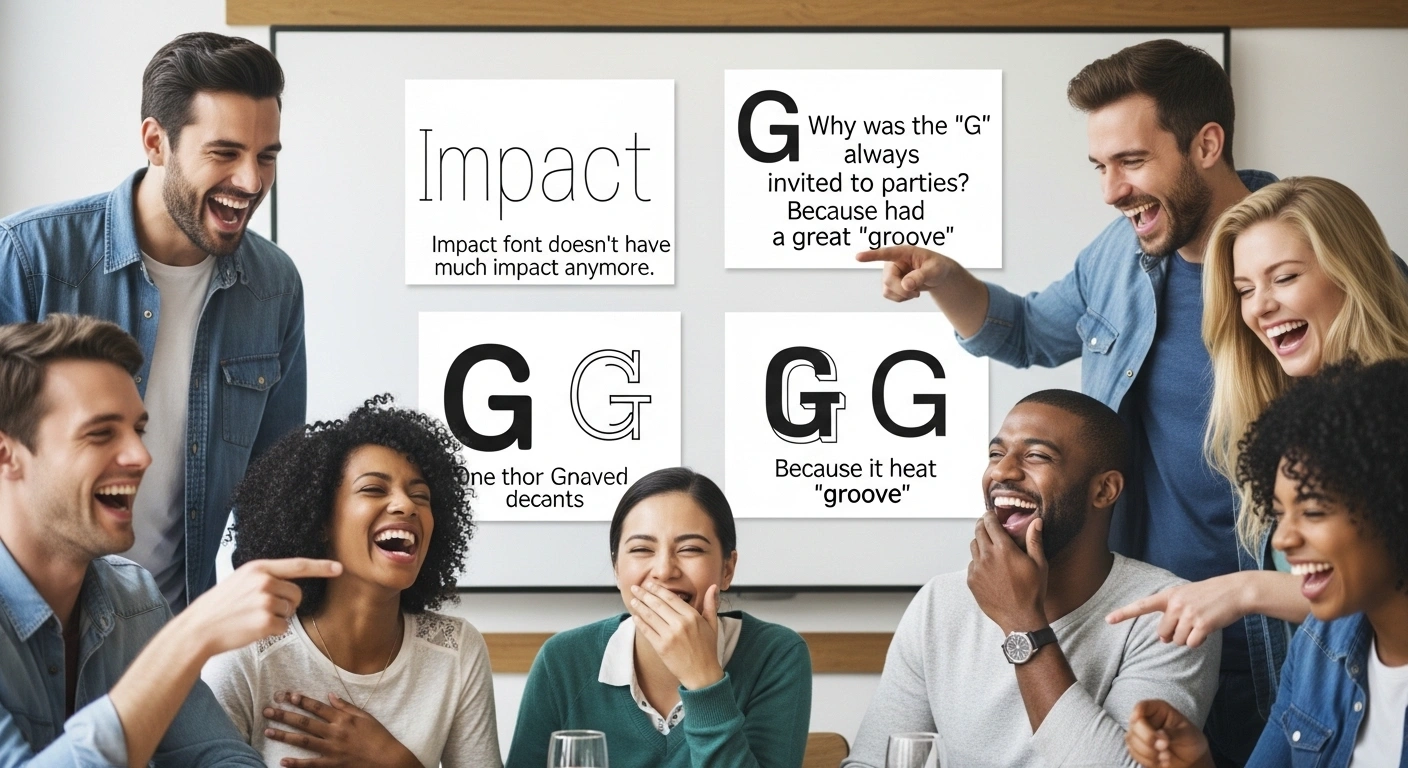
Impact font: all caps, all laughs.
Fonts in memes: punctuation for punchlines.
Why did the meme font cry? Too much trolling.
Papyrus in Avatar: legendary bad taste.
Meme typography: bold, italic, viral.
Why did the font go viral? Perfect meme alignment.
Fonts + TikTok = viral humor.
Memes in Helvetica: clean, pun-filled fun.
Meme captions: leading with laughter.
Fonts in viral content: readable and funny.
Comic Sans in memes: ironically hilarious.
Meme font jokes: capital LOLs.
Typography and social media: pun-tastic.
Meme letters: bold humor everywhere.
🕹️ Movie & TV Font Jokes
Why did the movie poster font cry? Bad leading.
Horror movie typography: kerning with fright.
Why did the font audition? It wanted to be bold.
Times New Roman in a thriller? Too classic.
Movie title fonts: dramatic and punny.
Fonts in credits: italicized humor.
Why did the director pick Comic Sans? Nobody knows.
Film typography: spacing for suspense.
Font jokes on TV: punchlines on screen.
Cinema posters: readable, dramatic, funny.
Subtitle fonts: small but hilarious.
Movie fonts: action-packed jokes.
Animated films: fun with playful letters.
TV show titles: pun-tastic type.
Font humor: blockbuster laughs.
🧩 Puzzle & Brainy Font Jokes
Why did the font get stuck in a crossword? Too many missing letters.
Typographers love puzzles—they kern every clue.
Why did the scrambled font go to therapy? It couldn’t align its thoughts.
Fonts in Sudoku: perfectly spaced solutions.
Why did the crossword font blush? It found the right match.
Font riddles: letter-perfect fun.
Why do puzzles and fonts go well together? They both need spacing.
Hidden message jokes: kerning is the key.
Why did the font fail the puzzle? Misaligned letters.
Brain-teaser fonts: think, laugh, repeat.
Word search humor: finding letters, finding laughs.
Why did the designer love cryptograms? Fonts make it pun-tastic.
Puzzle typography: spacing matters more than you think.
Fonts in logic puzzles: carefully arranged hilarity.
Font riddles: solve them for laughs.
💡 How to Use Font Jokes (Tips)
Perfect for designers, writers, and creative social media posts
Great for blogs, newsletters, presentations, and office humor
Use puns and typographic quirks for shareable content
Ideal for light-hearted self-deprecation or designer community laughs
Combine with visual examples, memes, or font samples for impact